
Digital visiting card design: the practical guide
No theory about grids and golden ratios - just the anatomy, ordering and details that make a profile people actually act on.
Design a digital visiting card around one screen: photo, name and a one-line pitch at the top, then call, WhatsApp and save buttons immediately below - all visible without scrolling. Use one accent colour for actions and high text contrast, order everything else (services, gallery, testimonials, payments) after the action buttons, and check the result on a budget Android phone before publishing.
Profile from ₹199/year · works with no card · add the NFC card for ₹1,699 whenever you want one
The above-the-fold anatomy
Four blocks own the first screen on a phone. If a visitor scrolls, it is because of these.
Photo + name
Recognisable headshot, the name people should save in their phones, designation under it. Everything else follows these two.
One-line pitch
What you do, for whom - "Tax filing for small businesses in Kochi". One line, no adjectives.
Action buttons
Call, WhatsApp, save contact - the three things a first-time visitor most wants to do, above the fold on every phone.
Trust strip
Location, years of practice, client logos or review count - just enough to justify the tap on the buttons above.
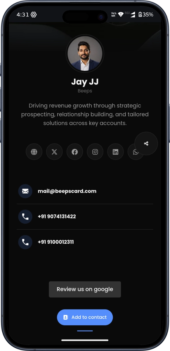
A finished profile: pitch, actions and identity in the first screen.
The section order that converts
Identity, action, offer, proof, commitment - in that order, because that is how trust is built on a screen.
The do and do-not list
- Design for the thumb: buttons full-width on mobile, one per row
- Use one accent colour for actions - every extra colour dilutes the tap
- Keep the pitch to one line; if it wraps twice, cut an adjective
- Crop the photo square, face centred, eyes in the upper third
- Dark text on light or light on dark - contrast first, brand second
- Leave whitespace between blocks; a profile breathes or it shouts
- Wallpaper backgrounds behind text - readability dies first
- Six fonts because they were free; two is a system, one is a statement
- Auto-playing music or video nobody asked for
- Every award you have ever won above the action buttons
- Contact forms as the only way to reach you - give people call and WhatsApp buttons too
- QR codes pointing at a different page than your main link
One-line pitch templates, by profession
The shape is the lesson: who it is for, what outcome, one proof point. Swap the specifics.
"General physician, Kochi. Same-day appointments, home visits for elderly patients."
"I help D2C brands cut ad spend waste with better analytics. 40+ audits delivered."
"German kitchen fittings, installed and serviced. Showroom open 7 days in Kakkanad."
"2 & 3 BHK specialist in Whitefield. Verified listings only, site visits on weekends."
"Health and term insurance for young families. Claims support included for every policy I sell."
Six design mistakes
Everything above the fold
Cramming services, gallery and testimonials before the action buttons. The visitor came to reach you - let them.
The mystery pitch
"Passionate about leveraging synergies" says nothing. Name the customer and the outcome in one line.
Thumbnail-invisible photo
If the face is unrecognisable at 48px, the profile has no anchor. Fix the crop before fixing anything else.
Price-free services
Ranges filter enquiries and anchor negotiations. "From ₹X" costs nothing to publish and saves endless chat.
Inconsistent branding
One accent colour on the profile, a different one on the printed QR card. Pick once, apply everywhere.
Designed on a laptop only
Your profile is opened by a tap or a QR scan, so virtually every visitor arrives on a phone. Check it on a small screen before anything else - including this guide.
Ready to build? The step-by-step creation guide.
Design questions
What should go at the top of a digital visiting card?
Photo, name, a one-line pitch, and the action buttons (call, WhatsApp, save contact). Those four elements are the entire above-the-fold job - everything else can wait one scroll down.
Which colours work best for a digital business card?
One accent colour for buttons and highlights, on a dark or light base with strong text contrast. The accent should be the only thing competing for the tap; multiple colours compete with each other and the visitor wins nothing.
How do I write my one-line pitch?
Name the customer and the outcome: what you do, for whom, where. Cut every adjective that survives without evidence. The templates above are starting points - replace the specifics, keep the shape.
Should I use a dark or light theme for my profile?
Whichever your photo and logo read best on - that decides it, not fashion. Dark themes suit strong logos and product galleries; light themes suit services where clarity signals trust. Contrast is the only hard rule.
How do I design the QR for print materials?
High contrast, a clear white border - DENSO WAVE, which created the QR code, asks for a quiet zone four modules wide - and a short label under the code saying what it opens. Print it larger than the minimum: DENSO notes the larger each module, the more stable and easier to read the code. Our QR print rules work out the size; test the printout from arm’s length with two different phones before running a thousand copies.
Sources: DENSO WAVE, DENSO WAVE
Sources
QR code print rules are DENSO WAVE's, the company that created the QR code; see our full QR print rules for sizes. Each was read on the date shown.
- DENSO WAVE, Point for determining the code area. Checked .
- DENSO WAVE, Point for setting the module size. Checked .